Clippers Embrace Nautical Theme in Major Rebranding
The Los Angeles Clippers have unveiled a sweeping rebrand, including a new primary logo, secondary logos, wordmarks, and uniforms, that will debut in the 2024-25 NBA season. The refreshed brand identity embraces the franchise’s nautical roots with ship and sailing motifs woven throughout the new visual package.

Primary Logo Features Ship and Compass Imagery
The most striking aspect of the rebrand is the new primary Clippers logo, which features a stylized letter “C” framing a compass pointing north. The north marker integrates the “N” from Los Angeles.
Inside the “C” shape is the silhouette of a fast-approaching clipper ship, with the hull stylized to resemble the seams of a basketball.
The logo brilliantly fuses the team’s ties to seafaring vessels with iconography representing their direction and journey as a franchise. The compass and ship imagery visually establish concepts of movement and travel, nodding to the future while honoring the past.
Color Scheme Includes Classic Clippers Hues
The new visual identity implements the Clippers‘ established color palette of navy blue, white, red, and powder blue. The revitalized color scheme is meant to feel familiar yet elevated.
Navy blue takes on increased prominence throughout the branding.
Typography and Wordmarks Modernized
The Clippers are keeping their traditional team name wordmark but have updated the lettering. The refreshed font removes some of the thicker, cartoonish outlining to create a more streamlined and serious look.
The Los Angeles and Clips wordmarks have also been reimagined to better fit the overall rebrand.
New Uniforms Align with Bold Brand Identity
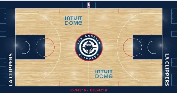
The on-court redesign coincides with the grand opening of the Clippers‘ new home arena, Intuit Dome, for the 2024-25 season.
The team will boast three new uniform editions that visually support the franchise’s refreshed identity.
Icon and Association Jerseys Feature Updated Clippers Wordmark
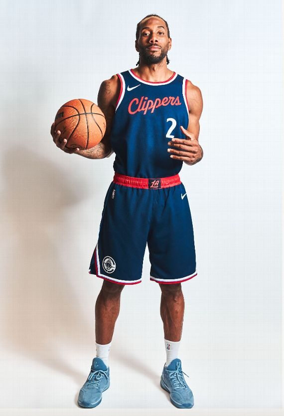
The Clippers are implementing Icon (white) and Association (navy blue) jerseys as their primary home and away uniforms. Both feature the updated Clippers wordmark prominently on the chest, with the stylized “LA” logo and compass “C” logo integrated elsewhere into the streamlined design.
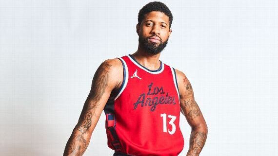
Statement Uniforms Showcase “Los Angeles” Lettering
As with all NBA teams, the Clippers will also have a third Statement jersey that offers a bold alternate look.
Their Statement uniform is red with “Los Angeles” lettering in place of the customary team name on the front. The Clippers‘ popular “Clips” nickname appears on the waistband.
Nautical Symbols and Easter Eggs Found Throughout
Careful observers will notice several additional naval references on the new jerseys, including nautical flags on the sides and shorts that visually spell out “LAC.”
The tiny details showcase the Clippers‘ commitment to honoring their unique history in the rebrand.
Fan Response Largely Positive So Far
Early social media reactions to the Clippers‘ new visual direction have been mostly enthusiastic.
Some fans call the primary logo clever and praise subtle touches like the compass and hidden symbols. Others believe the simplicity of the uniforms properly puts the focus on the players and team identity.
There is also some dissent among Clippers fans regarding the significant rebrand. Detractors call the primary logo boring or too generic, lacking the energy and charisma befitting Hollywood’s team.
However, even critics seem supportive of efforts to strengthen ties between the franchise and the nautical theme.
Final Stage of Franchise Advancement Under Ballmer
The comprehensive rebranding marks the culmination of Steve Ballmer‘s front office remodeling since becoming owner in 2014.
Focus groups revealed fans did not want a name change from Clippers, so Ballmer invested in revitalizing the existing visual identity. The new direction embraces the team’s current championship window while laying the groundwork for sustainable success.
For the Clippers, the refreshed logos and uniforms signal a new era of on-court excellence for a franchise determined to compete for NBA titles every season. As the team settles into its spectacular new Inglewood home, their fresh look provides energy and purpose befitting a title contender.


